Wednesday, 11 May 2011
Tuesday, 10 May 2011
Individual Evaluation
Monday, 9 May 2011
Group Evaluation
Typical Audience
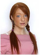
Debra MacMillan
Age 19
Boyfriend
WhiteMiddle classed
Lives with her mum, step dad, younger brother and 2 younger sisters in a council house in the outskirts of a big town
Studies beauty therapy and works part time at the cinema distributing popcorn
Debra enjoys going out drinking with her mates on the weekend, either to a friend’s house or out clubbing. Aims to become a hair dresser and one day open her own salon
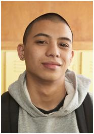
Tyrelle
Age 21
Black
Single
Upper middle class
Lives at home with mum and dad in a nice house in the suburbs
Studies sports at university and a part time bartender
Tyrelle enjoys playing sports such as football and cricket. He also plays alot of video games in his spare time. Aims to become a P.E teacher or personal trainer.
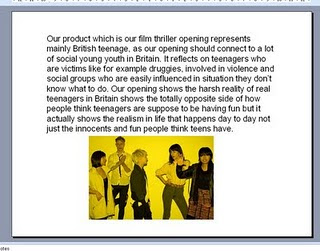
Our target audience is aged from 15-late 20s. Lower to upper middle class males and females. Although predominately more males. We have aimed the film at this type of audience as they are the main cinema customers. Our target audience would mainly be from the working class as and at a wide variety of classes to optimise viewers. We’ve tried to achieve this by creating character that the tagert audience would be interested in. By making them roughly the same age and of the same class we hope the audience would be attracted to Bill. We have kept the violence, swearing and sexual content to a minimum of BBFC guidelines to make Bill no more restricted than a 15 so we don’t lose any of our audience and opening it to the wider public. We took our questionnaire results into consideration as this was from our target audience that we needed to cater to, so tried to make a contemporary film, with added noir aspects and stylistics.
Attract/address the audience
We tried to make a story line that the audience would buy into. And make it based in a place that our target audience may have grown up or are currently occupant. We also made it so the audience could relate to on so many level; Abusive relations ships, Making hard decisions, Taking the wrong path in life, Growing up in a rough area, all things that our target audience may personally have encountered or know people that have.
The characters were based on people that actually exist in real life, we all know a ‘jack the lad’ and a mysterious girl. The ordinary type of people caught up in sticky situations to get out of hand, and try to make the audience feel interacted as this could happen to someone they know or themselves and can relate. And the costumes reflected the commonness of the characters of the casual clothing, to how they act.
We tried to incorporate the titles in with the shots and editing so that the audience could digest the text whilst consuming the footage but also to keep the audience interested and reframe them from getting bored of solid text. We also tried to keep the pace of the piece quite fast to keep the audience attention and interested. But not too fast that you can’t see the emotions and the ideology behind some shots eg blood on the hands and sitting all alone, feeling alone in the world. We used a piece of music that we thought would give an effect of uneasiness and that something had done wrong. Music that gave an edge on the whole piece further more leaving the audience questioning.
We hope the attraction came from the setting of your average place in England that everyone has seen, been to, lives in. And that the characters are easily related to and that people know or are just like these character. Also that the storyline can be interpreted to so many things that people also can touch into; violence, relationships, love. And that the enigma of what happened and the questions keep them hooked and really involved in the story and the characters.
Media Distribution
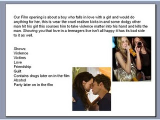
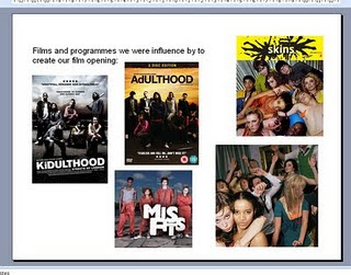
How does our film represent social groups?
TECHNOLOGIES
Monday, 2 May 2011
- We added Light ray effects added to the flashback of the dead body give mysterious look to it.
- We added car sounds to the main (street) flashback create an urban effect
- We lowered the sound from the main flashback because it was a windy day and the sound gear picked up too much unwanted noise
- We moved the flashbacks of the dead body to make it fit to the character, because it didn’t fit in because it didn’t make sense being flashback straight after flashback.
- We added an effect called “over drive” To the flashback of the fight scene and we changed the white and gray colours to create an effect so it was clearly a flashback.
- We shortened the fight scene and sped it up to make it appear more violent and more physical to the audience.
Tuesday march 15th
- We put a fade on the shot where Ashley is opening the bathroom door and we also put a fade on the flashback where the door is being opened in order for the shot to swap over nicely and smoothly from the present to the flashback.
- We put on the title of the film “Bill” and also the production titles such as “ a teleport production” and “BXU” which are our production companies.
- We added a bit of non diegetic music at the beginning of the scene, this is our start off point for music in the scene.
- We deleted the close up shot of Ashley as it appeared too quick on the edit and so was unappealing to the eye.
Tuesday march 22nd
- We recorded the voice over and cut and paste it onto our film noir style opening
- We typed out and researched the audience views via a questionnaire
Tuesday march 29th
- We changed the colour on a clip of Ashley as the colouring stood out compared to the other clips as it was too red/orange. Because of the colour difference we altered the orange clips with a colour altering effect.
- We placed the voiceover clips in the correct place so it made the best out of the scene, we placed a large section of the voiceover on a large shot so that the clip appeared less boring to the audience.
- We decreased the volume of the music where the voiceovers were also playing so the voiceovers were audible.
- We faded the music just before the voice clips so the alteration in music was not too noticeable
- We added character titles in so the actors are known within the opening sequence, we placed the titles over the shots on an invisible background so the titles linked in well with the opening scene.


